Excel shortcuts are keyboard combinations that allow you to perform tasks quickly without the need to navigate through menus or use the mouse. Using shortcuts can save you a significant amount of time and make your workflow smoother. When it comes to creating graphs in Excel, using shortcuts can help you select data, choose the right graph type, customize the appearance, and much more. By mastering these shortcuts, you can become a graphing pro in Excel.
Selecting Data for Graphs
To create a graph in Excel, you first need to select the data you want to include in the graph. Here are some useful shortcuts for selecting data:
Ctrl + Shift + Arrow Keys: Use this shortcut to quickly select a range of data. Press Ctrl + Shift + Right Arrow to select the entire row of data, and Ctrl + Shift + Down Arrow to select the entire column of data.
Ctrl + Shift + Home: This shortcut selects the entire data range from the current cell to the top-left cell of the worksheet.
Ctrl + A: Pressing Ctrl + A selects the entire dataset if you have a contiguous range of data.
Ctrl + Shift + * (Asterisk): Use this shortcut to select the current region, which is the range of cells that contain data and are surrounded by empty cells.
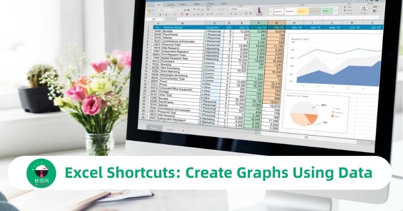
Creating Graphs
Once you have selected the data, it's time to create a graph. Excel offers a variety of graph types, including bar graphs, line graphs, pie charts, and more. Here are some shortcuts to help you create graphs quickly:
Alt + F1: Pressing Alt + F1 creates an instant column chart using the selected data.
F11: This shortcut creates a default column chart on a new worksheet.
Alt + Shift + F1: Use this shortcut to insert a new chart sheet with the default chart type.
Alt + Shift + F11: Pressing this shortcut inserts a new chart sheet with the default chart type as an embedded object.
Customizing Graphs
Once you have created a graph, you might want to customize its appearance to make it more visually appealing and informative. Here are some shortcuts to help you customize your graphs:
Ctrl + 1: Pressing Ctrl + 1 opens the Format Chart Area dialog box, where you can modify various aspects of the chart, such as the fill color, border color, and effects.
Ctrl + 2: This shortcut opens the Format Data Series dialog box, allowing you to customize the appearance of individual data series within the chart.
Ctrl + 3: Use this shortcut to open the Format Data Labels dialog box, where you can add or remove data labels and customize their appearance.
Ctrl + 4: Pressing Ctrl + 4 opens the Format Axis dialog box, allowing you to modify the appearance and scale of the chart axes.
Navigating and Editing Graphs
When working with graphs in Excel, it's important to be able to navigate and edit them efficiently. Here are some shortcuts to help you with that:
Ctrl + Tab: Use this shortcut to switch between the chart and the worksheet.
Ctrl + Shift + Tab: Pressing Ctrl + Shift + Tab allows you to cycle through the elements of the chart, such as the plot area, legend, and data labels.
Ctrl + C: This shortcut copies the selected chart to the clipboard, allowing you to paste it into another location or application.
Ctrl + V: Pressing Ctrl + V pastes the chart from the clipboard into the current location.
FAQ: Frequently Asked Questions
Can I use these shortcuts in all versions of Excel?
- Yes, these shortcuts are applicable to most versions of Excel, including Excel 2010, Excel 2013, Excel 2016, Excel 2019, and Excel 365. However, some older versions of Excel may have slight variations in shortcut keys.
Are there any shortcuts for specific graph types, such as pie charts or linecharts?
- Yes, the shortcuts mentioned in this article are general shortcuts that can be used for creating and customizing various graph types in Excel. However, some specific graph types may have additional customization options or shortcuts that are unique to them.
Can I customize the appearance of individual data points in a graph?
- Yes, you can customize the appearance of individual data points in a graph using the Format Data Series dialog box. This allows you to change the color, marker style, and other visual aspects of specific data points within the graph.
Is it possible to create multiple graphs from different datasets in the same Excel worksheet?
- Yes, you can create multiple graphs from different datasets in the same Excel worksheet. Simply select the data for each graph separately and use the appropriate shortcuts to create the desired graph types.
Are there any shortcuts for adding trendlines or error bars to graphs?
- Yes, there are shortcuts for adding trendlines and error bars to graphs in Excel. To add a trendline, select the data series and press Alt + J + T. To add error bars, select the data series and press Alt + J + E.